

At Duo Collective, our Duo Gives Back program is all about teaming up with heart-driven nonprofits and turning their passion into unforgettable brands. This week, we’re shining the spotlight on STAAR. They are a 100% volunteer crew on a mission to Survive, Thrive, Advocate, and Advance Research.
From the minute their application landed in our inbox, we were blown away by their grit and purpose. So we rolled up our sleeves and crafted a custom brand suite that not only brings STAAR’s mission to life but embodies our promise to get brands seen while fueling impact, funding, and a rallying cry for their community.
Meet The STAAR Foundation
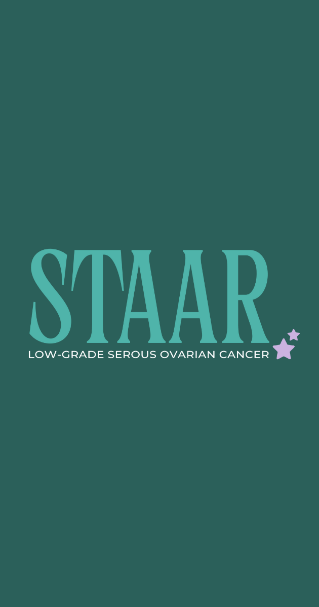
STAAR is the first U.S. foundation dedicated to funding low-grade serous ovarian cancer (LGSOC) research. STAAR stands for Survive, Thrive, Advocate, and Advance Research. The organization was founded in 2020 when three women facing ovarian cancer recognized the need for funding and support. It has evolved to become a community for people with the disease. This 100% volunteer-run foundation exists to fund research for better treatment options for this rare form of ovarian cancer.
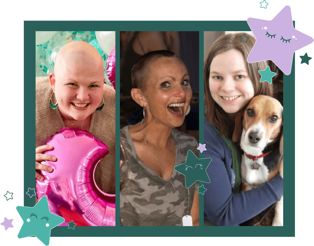
STAAR is an inclusive space for low-graders to join efforts to control their disease by raising the funds researchers need and creating fellowship with one another. They work hard to advance research, raise awareness, advocate for those living with LGSOC, and remember those that this disease has taken.
See what they’re up to on Instagram, and if it’s in your heart, please consider supporting this wonderful organization through donations, fundraising, or volunteering.
Why Nonprofit Branding Matters
When it comes to nonprofits, a clear and compelling brand isn’t just a “nice-to-have”, it’s what powers your mission forward. Here’s how having a strong nonprofit brand moves the needle:
1. Builds Trust at First Glance
Your visual identity and tone of voice are like your organization’s handshake. A cohesive logo, color palette, and messaging instantly signal professionalism and care. So donors, volunteers, and partners know you’re the real deal before they even click “Donate.”
2. Amplifies Your Mission
Think of your brand as a megaphone for your “why.” When your visuals, words, and stories align, every post, email, and event becomes a clear, unforgettable call to action.
#3. Drives Funding & Volunteer Power
A refreshed brand can energize your fundraising appeals and volunteer outreach by presenting an inspiring, trustworthy, and shareable identity. This helps make supporters excited to give their time, talents, and resources.
#4. Unites & Energizes Your Community
Consistent patterns, thoughtful submarks, and a voice that echoes your values give supporters a shared badge of honor. When everyone— from a first-time donor to a decade-long volunteer— speaks the same brand language, you create a rallying cry that’s impossible to ignore.
Our Brand Building Discovery Process
We kicked off STAAR’s rebrand the same as every branding client of ours— with a deep-dive questionnaire. Why? Because every memorable brand starts with listening. This is where we ask the big-picture and nitty-gritty questions that set the stage:
- What inspired you to launch STAAR?
- What aren’t you loving about your current brand positioning?
- What story does your name tell?
What We Learned
A few non-negotiables emerged as we read through their questionnaire and that’s exactly the kind of clarity we live for! We want to hear what you’ll never compromise on, because our job is to build a brand that feels 100% yours, not ours. Having those “must-have” elements on the table from day one means every design choice we make is rooted in your vision and values. And here’s what we found out:
- Keep the Star: STAAR’s name literally calls for a star so our primary logo had to sparkle with one.
- Embrace Teal: Their signature teal hue had to stay front and center because it’s become synonymous with hope in their community.
- Humanize That Icon: They wanted a “humanized” star. A symbol that felt friendly, fierce, and alive.
With those non-negotiables locked in, we turned our focus to STAAR’s personality. Defining the key emotions and energy their brand needed to spark at every touchpoint:
- Hopeful: A palette and shapes that whisper “there’s light ahead.”
- Resilient: Solid forms and confident type that stand strong.
- Joyful: A touch of playfulness to remind folks that community can be celebratory, even in tough times.
- Fierce: Bold accents and dynamic layouts that reflect STAAR’s advocacy spirit.
- Hard-Working & Community-Driven: Patterns and submarks that feel like a rallying banner every supporter becomes part of the mission.
Armed with these insights, we moved from questionnaire to concepting. Using the moodboard phase to explore every color, font, and icon that tells STAAR’s story of survival, advocacy, and collective strength. Take a peek at the before and after for yourself.
Why We Made These Design Choices
A Strong Color Palette
- Before: STAAR’s signature teal was already tied to hope but felt buried in secondary collateral.
- After: We elevated teal as the primary hue and paired it with warm accent tones. These complementary tones evoke hope, strength, and community spirit. This palette now strongly reflects the organization’s emotional and advocacy-driven goals.
A Modern Typeface
- Before: A single typeface gave STAAR a serious tone but risked feeling clinical.
- After: We paired a timeless serif (for legacy and trust) with a clean sans-serif (for clarity and approachability). The mix of these fonts creates a striking balance between the serious nature of their cause while ensuring readability and modern aesthetics.
A Star That Speaks Human
- Before: Their old icon was a generic star shape; strong, but impersonal.
- After: We sculpted a “humanized” star with subtle curves and movement to symbolize resilience, guidance, and the beating heart of their volunteer community.
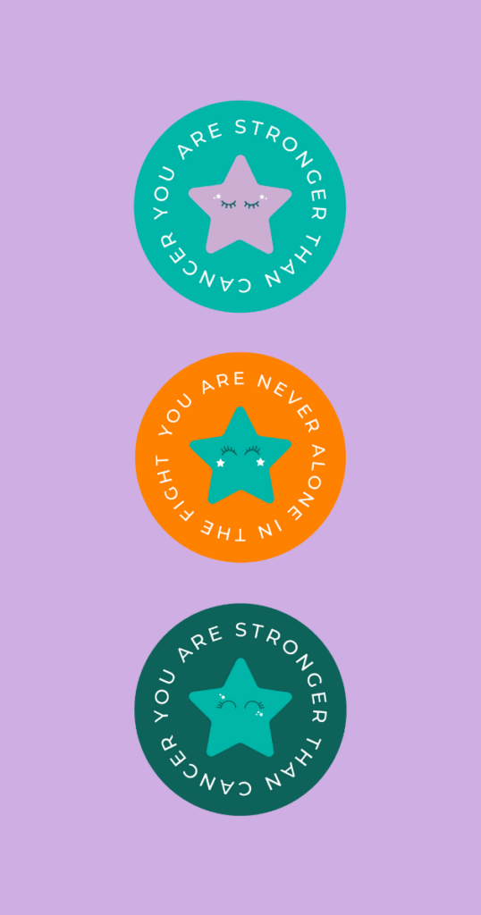
Submarks That Rally their Mission
- Before: Inspirational phrases lived only in long-form copy.
- After: We embedded “You are stronger than cancer” into shareable submarks so every sticker, social graphic, and slide deck doubles as a mini-pep rally.
3 Nonprofit Branding Strategies to Rally Your Community
Every nonprofit needs more than good intentions— they need a brand that sparks excitement, builds trust, and unites people around a shared purpose. Here are three nonprofit branding strategies we used to amplify STAAR’s identity. From a crystal-clear name to a cohesive visual system and a voice that doubles as a rallying cry, these tactics will make your nonprofit branding not just seen, but unforgettable.
1. A Strong Name For Instant Recognition
Your nonprofit’s name is your first impression. So make every word count. STAAR’s original title hinted at ovarian cancer, but didn’t call out the rare LGSOC focus. By updating to “STAAR – Low-Grade Serous Ovarian Cancer Foundation,” we…
- Eliminated confusion: New supporters immediately know who you serve.
- Boosted searchability: Including “low-grade serous ovarian cancer” helps people find you when they need you most— hello keywords.
- Set the tone: A precise name becomes a north star for all messaging, so every headline, social post, and email echoes your mission.
- Quick Tip: If your cause has a niche focus (like LGSOC), don’t shy away from spelling it out for both SEO and clarity.
OLD: STAAR – Ovarian Cancer Foundation. Survive, Thrive, Advocate, Advance Research.
NEW: STAAR – Low-Grade Serous Ovarian Cancer Foundation
2. Create One Cohesive Look Across All Channels
A unified look turns one-time visitors into lifelong advocates. For STAAR, we:
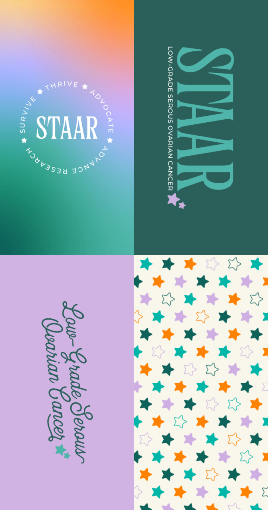
- The Gradient Backdrop ties hope (lavender) to resilience (teal) in one seamless blend.
- Balanced Typography pairs a legacy-feel serif with a clean sans-serif for readability and warmth.
- Versatile Assets from circular badges to repeating patterns, ensure every piece of collateral feels like it’s part of the STAAR story
- Quick Tip: Create a simple style guide (colors, fonts, icon treatments) and share it with everyone on your team so everyone can truly embody the brand.
3. Speak with One Voice
Your tone should feel like a rallying cry. We gave STAAR a warm-yet-fierce voice by:
- Swapping Jargon for Heart: Turning clinical terms into heartfelt calls-to-action so patients feel seen.
- Embedding Empowerment Taglines: Phrases like “You are stronger than cancer” become mini pep rallies on every flyer and footer.
- Maintaining a Consistent Rhythm: Whether it’s an email, social post, or event script, every line now carries the same confidence and compassion.
- Quick Tip: Choose a handful of “pep phrases” or taglines that reinforce your mission, and weave them into all your communications.
Apply these three nonprofit branding tactics— name clarity, visual cohesion, and a unified voice— and you’ll rally your community around a brand and mission that’s impossible to forget.
Your Nonprofit Brand’s Next Chapter Starts Now
Branding for nonprofits is all about strategy, storytelling, and building trust. So every stakeholder, from donors to volunteers, feels confident in your cause. STAAR had their mission, vision, and values locked down; we simply brought that purpose to life through their brand.
With their brand kit in hand, the STAAR team ran with it. Rolling out their vibrant new look across their website, social posts, fundraising emails, event banners, and more. And we couldn’t be more proud of this brand launch being officially released to the wild.
Apply for Duo Gives Back
Are you—or do you know—a heart-driven nonprofit that deserves a brand glow-up? Apply or nominate a friend for our Duo Gives Back program, and we’ll surprise one deserving organization each year with a full branding suite that helps you get seen, remembered, and ready to unite your community.
Before you go, dig into our other Duo Gives Back project with Gloves for Grief!


+ show Comments
- Hide Comments
add a comment