Apple Podcasts | Spotify
Today, we’re diving into a topic that’s more than meets the eye—literally. We’re talking about color theory and what your brand’s colors really say about you.
Did you know that up to 90% of snap judgments about products are based on color alone? That’s huge!
Colors are powerful storytellers, and they can be the difference between a brand that blends in and one that stands out. So, whether you’re starting a new brand or refreshing an existing one, choosing the right colors is critical.
By the end of this episode, you’ll understand how color influences perception, discover examples of brands nailing it with their palettes, and get actionable tips to find the perfect colors for your business.
So, Which Colors Should You Use?
Well, there’s no easy answer. If you search for brand color theory, you can find dozens of articles that break down what each color “means.”
For example, warm colors like red, orange, and yellow tend to create a sense of excitement, energy, warmth, and confidence, while cooler blue is dependable, strong, and secure. Green evokes nature, growth, and freshness, and purple reminds us of wisdom and imagination.
But it’s really not that straightforward. Something as simple as changing the shade or tone of a color can create different emotions. Even similar colors applied in different contexts can change the meaning and effect. Barbie pink and T-Mobile pink are functionally almost the same color, but because of the vastly different brand voices and strategies behind the color, the pink evokes different reactions in their audiences.
What Is Color Theory?
At its core, color theory is the study of how colors interact and how they can evoke emotions, influence decisions, and communicate messages. It’s not just about what’s pretty—it’s about what works.
Let’s start with the basics:
- Primary Colors: Red, blue, and yellow. These are the building blocks of all other colors.
- Secondary Colors: Green, orange, and purple, which are made by mixing primary colors.
- Tertiary Colors: The in-betweens, like teal or magenta.
Then there’s the temperature of colors:
- Warm Colors like red, orange, and yellow are energizing and attention-grabbing.
- Cool Colors like blue, green, and purple are calming and trustworthy.
And finally, we have color harmony:
- Complementary Colors sit opposite each other on the color wheel—like red and green.
- Analogous Colors are next to each other—like blue, teal, and green.
- Triadic Colors form a triangle on the wheel—like red, blue, and yellow.
Understanding these basics helps you make deliberate choices that align with your brand’s message.
Color Theory Psychology: What Do Colors Say About Your Brand?
Colors don’t just look good—they make us feel things. Here are a few examples of what colors can communicate and some brand examples for each color.
- Red: Passion, urgency, excitement. Coca-Cola: The bright red packaging embodies excitement and passion, perfectly aligning with the brand’s dynamic, refreshing energy.
- Blue: Trust, dependability, calm. Calm (meditation app): Dominates with serene blue tones, reflecting tranquility and trust in their stress-relief solutions.
- Yellow: Cheerfulness and energy. Sun Bum (sunscreen): Sunny yellow packaging aligns perfectly with the beachy, cheerful vibe they aim to promote.
- Green: Growth, health, and relaxation. Whole Foods: The deep green in their branding represents health, sustainability, and their commitment to fresh, organic products.
- Purple: Creativity and luxury, like Cadbury’s rich purple. The regal purple packaging symbolizes indulgence and luxury, making every piece of chocolate feel like a special treat.
- Black: Sophistication and power—Chanel owns this space. The sleek black branding exudes timeless sophistication and understated elegance, perfectly reflecting Chanel’s high-end, iconic status in the fashion world.
So, think about your brand’s personality. Is it bold and energetic? Calm and trustworthy? Sophisticated and exclusive? Your colors should reflect that.
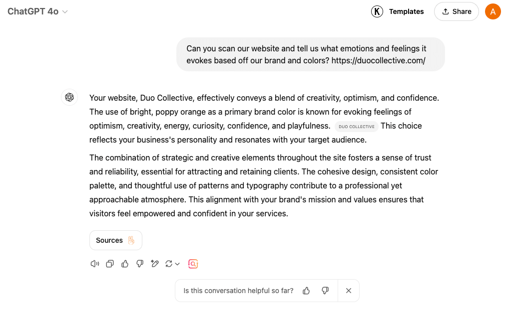
P.S. You can ask ChatGPT what your brand colors say about your company!

Brands That Do Color Theory Right
Let’s talk about some popular brands that absolutely nail their color game.
Tiffany & Co.
Tiffany’s iconic blue is synonymous with luxury, elegance, and timeless romance. The soft yet striking shade is distinctive and evokes feelings of exclusivity and sophistication. It’s not just a color; it’s an experience that signifies something special, whether it’s a gift or a moment to cherish. Unwrapping that signature blue box feels magical—like you’re holding a piece of tradition and refinement. The color alone speaks volumes, making the entire experience feel intimate and memorable.
Welly
Welly’s cheerful and vibrant packaging, featuring bold patterns and lively colors, reflects their mission to make first aid less daunting and more approachable. The bright tones instill positivity and resilience, making their products feel fun and reassuring rather than sterile or clinical. The colors make you smile when you spot Welly on the shelf. It feels like a little boost of encouragement in your day, turning what could be a mundane necessity into something uplifting and thoughtful.
Google’s iconic combination of red, blue, yellow, and green symbolizes simplicity, playfulness, and universality. The primary colors (with a quirky green breaking the pattern) represent Google’s approachable yet innovative spirit, reflecting its mission to make knowledge and technology accessible to everyone worldwide. The bright, cheerful logo is like a gateway to endless possibilities. It feels welcoming, like the beginning of an adventure where you can search, learn, and discover almost anything. The colors remind you that even in a world of complex technology, Google keeps things simple, friendly, and fun.
These brands aren’t just choosing colors they like—they’re using them strategically to evoke specific emotions.
7 Tips and Tricks for Choosing Brand Colors
This is a lot of information about color theory to digest! Here are some strategic branding tips to help you make the final decision for your brand colors.
1. Start with One Dominant Color
This should represent your brand’s core personality and values. It will be the foundation for your color palette and appear most prominently in your marketing and branding materials.
2. Pair with a Neutral
Black, white, gray, or beige adds balance to vibrant and dominant colors. Every brand palette should have at least one neutral color.
3. Limit Your Palette
Stick to 2-3 main colors for simplicity and consistency. Too many colors can confuse your audience, while too few might make your brand feel flat or uninspiring.
4. Think About Emotion
Ask yourself, “How do I want my audience to feel when they see my brand?” If it’s trust, lean toward blue; if it’s excitement, consider red or orange.
5. Consider Context
Where will your colors appear? Bright colors might work online but could look overwhelming in print. Ensure your palette works across all mediums.
6. Use Tools
Check out branding tools like Canva, Coolors, or Adobe Color to experiment with color palettes and how they look in social posts or logos.
7. Think Long-Term
Make sure your colors are timeless and adaptable as your brand grows. You don’t want to have to go through an entire rebrand because you outgrew your colors! Leaning into fads or trends when it comes to color can really limit you as far as growth goes. Trends only last so long before the next one comes around.
Choosing your brand colors is a fun exercise (at least, in Court’s opinion!) Just be careful not to get too in the weeds with your research or decision-making. Our free brand basics DIY guide can help you get started!
6 Common Color Theory Mistakes to Avoid
Before you go off and start experimenting with color theory and choosing your brand colors, let’s talk about some common pitfalls to avoid.
1. Overusing Bold Colors
Too many bold and vibrant colors can overwhelm your audience. Stick to one or two.
2. Ignoring Cultural Context
Colors mean different things in different cultures. Research is key, especially if you target people in different countries.
3. Inconsistency
Once you choose your colors, stick with them across all branding materials. Your audience should be able to see your colors and connect them to your brand.
4. Having Too Many Colors
A cluttered palette can dilute your brand’s message. Stick to 2-3 primary colors and 1-2 neutral colors.
5. Having Too Few Colors
On the flip side, using only one color can make your brand feel monotonous. Add accents or complementary tones for balance.
6. Choosing Colors You Like, Not What Works
It’s tempting to pick your favorite color, but always prioritize what resonates with your audience and aligns with your brand’s values.
Are you ready to start playing with color theory and color palettes?! Take these tips and start brainstorming the emotions you want your audience to feel when they interact with your brand. Align your primary color to that feeling, and use tools to experiment with other complementary colors to add to your palette. Have fun!

If you liked today’s episode on The Duo On Air Marketing Podcast, don’t forget to leave us a review & subscribe!
More From The Duo
Sign Up for Tuesday Tips and Sips Newsletter
Abbey Oslin and Courtney Petersen are Minnesota-based marketing experts, educators, and co-founders of boutique marketing agency Duo Collective, which specializes in SEO, social media strategy, and branding for small business owners and creative entrepreneurs. To learn more about Duo Collective, or to inquire about working with our team, head over to www.duocollective.com.
To inquire about being a guest on Duo On Air, please fill out this application form.


+ show Comments
- Hide Comments
add a comment