

When Dahlia Orth reached out to us, she was standing at the crossroads so many creative entrepreneurs face— her brand looked beautiful, but it didn’t feel like her anymore.
She’d built a polished, professional reputation in the world of creative systems and HoneyBook setups, but deep down, she was craving something more fun, nostalgic, and unapologetically Dahlia. The kind of brand that felt like a 90’s movie quote, a spontaneous dance party, and a strategic system all rolled into one.
✨ Spoiler alert: That’s exactly what we built.
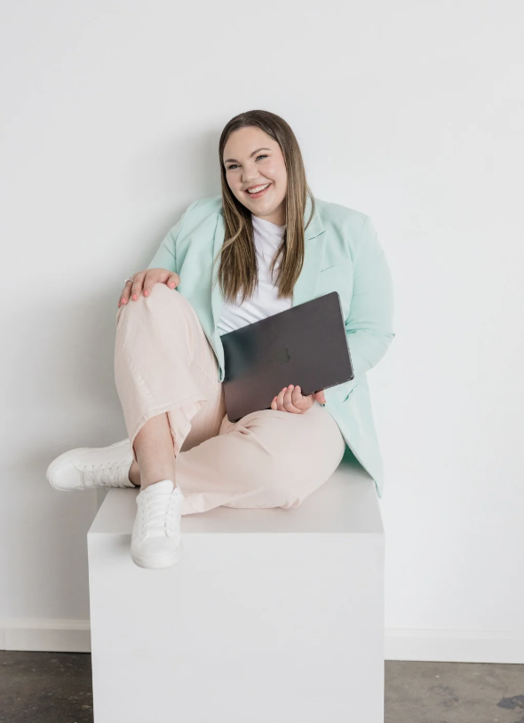
Who is The Honeybook Pro, Dahlia Orth Creative?
Dahlia Orth Creative helps creative entrepreneurs turn chaotic, time-sucking businesses into automated money-making machines. She’s a systems strategist and HoneyBook Pro who helps business owners design workflows that give them freedom— so they can build the business they love without sacrificing the people they love.
Her clients are photographers, educators, and service-based entrepreneurs. Women in all seasons of business who are tired of feeling bogged down by admin work and crave more time for what really matters. Whether they’re new in business or running full-time creative studios, Dahlia gives them the tools to work smarter and live freer.
Based in the Midwest and powered by coffee, pop culture quotes, and purpose-driven strategy, Dahlia’s brand bridges two worlds: warm and approachable meets streamlined and strategic.
The Branding Challenge
When Dahlia came to us, her old brand no longer reflected the person, or the business, she’d grown into.
She’d built her first brand early in her business journey, during a season where she was proving herself as a trusted systems expert. But four years later, she was ready to step into a new season of authority.
Her brand felt too young, too polished, and didn’t showcase the heart, humor, or personality she brings to every client experience. She wanted a visual identity that made people feel like they were sitting at her kitchen table— coffee in hand, ready to laugh, strategize, and make magic happen.
Related: is it time for a rebrand?
The Solution was a Rebrand…
Dahlia chose our Brand Basics Package, a branding experience designed to bring clarity, personality, and purpose into every design element.
But the fun thing about her brand is that she attended a conference with us in Arizona where she completed our Sip & Strategize Workbook to develop her entire brand strategy. (p.s. you can grab it too— it’s a free resource just for you with ChatGPT prompts and all!) Because she had her brand strategy defined we were able to add on a beautifully designed Style Guide to her package.
We are building a brand for you. Which is exactly why we customize each project to bring to life exactly what you need to finally feel confident.
We started the branding process by defining Dahlia’s brand personality, visually:
- Fun, nostalgic, and empowering
- Bubbly but strategic
- Rooted in integrity, creativity, and freedom
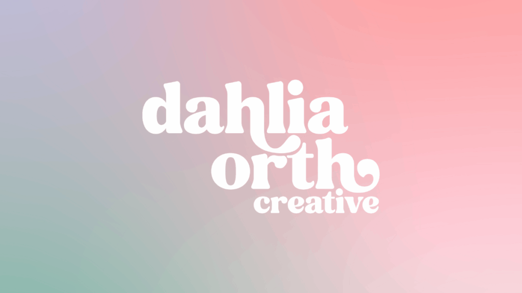
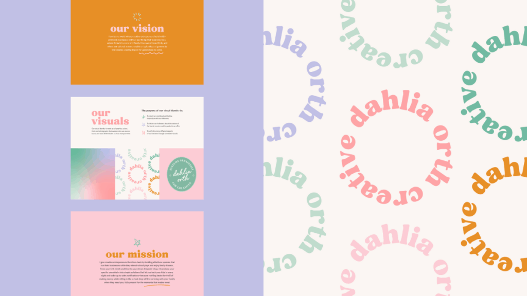
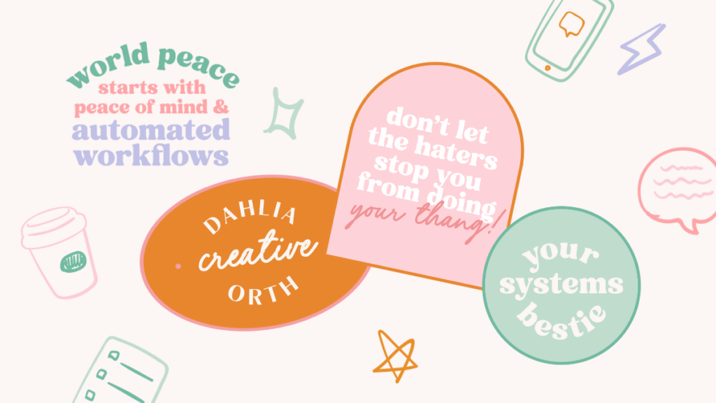
Then we built a color palette that felt soft yet confident— a playful mix of mint green, lavender, tangerine, and blush. These hues reflect her ability to bring calm to chaos, strategy to creativity, and joy to every project.
The typography leaned into retro charm with a modern twist, perfectly embodying her love for pop culture and 90s nostalgia while maintaining professional authority.
Every design choice, from the rounded lettering to the nostalgic stamp-style submarks, was rooted in the psychology of trust and joy.
What We Built
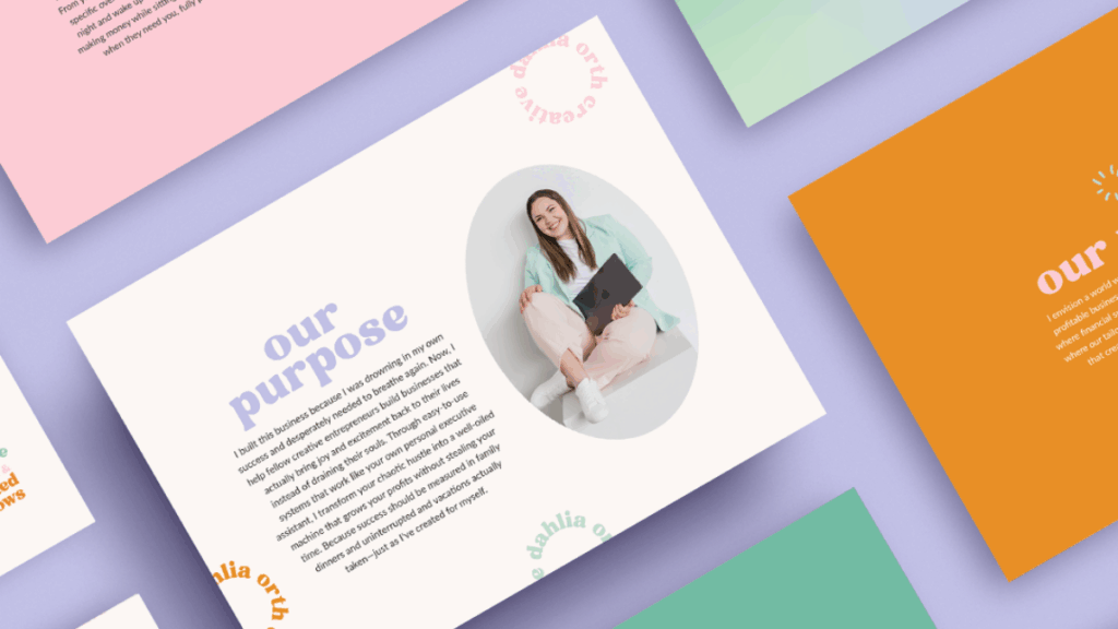
For Dahlia’s refreshed brand, we started with strategy— because before you can design a brand that looks like you, you have to uncover one that truly feels like you.
Dahlia began her journey with our workbook, diving deep into her brand’s mission, vision, voice, and values. Through that process, she found clarity around who she serves, why she does what she does, and how she wants people to feel when they work with her.
From there, we transformed that foundational strategy into a robust brand style guide— a visual system that brought her personality to life across every logo, color, and font.
Here’s what we built for her brand:
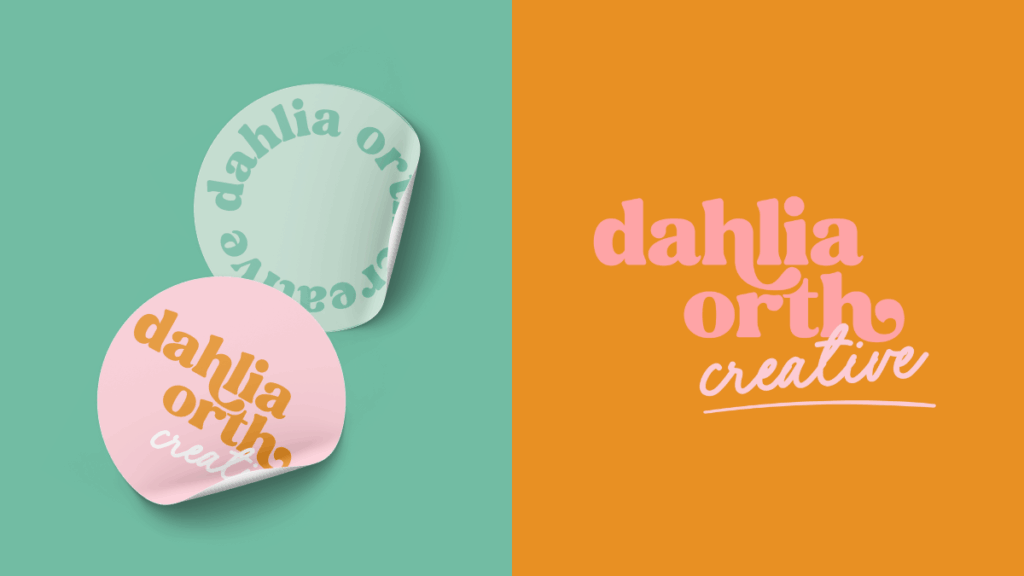
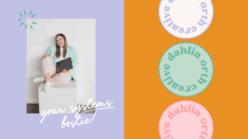
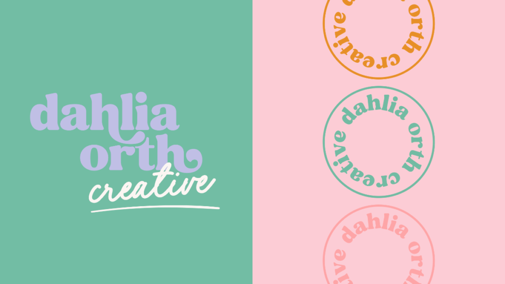
- Main Logo: A bold yet soft wordmark that captures Dahlia’s approachable confidence.
- Submarks: Nostalgic stamp-style icons inspired by her love for 90’s pop culture — perfect for social media and collateral.
- Color Palette: A mix of playful yet grounded hues… mint, lavender, blush, and citrus, that reflect joy, strategy, and freedom.
- Typography System: Rounded, modern fonts that balance creativity and professionalism.
- Custom Patterns + Iconography: Handcrafted elements that add personality and cohesion to her visual world.
Together, these pieces create a brand that feels bubbly, confident, and fully aligned— a seamless extension of Dahlia’s mission to help creatives find freedom through systems that actually work for them.
The Result & Big Brand Reveal!
When we revealed the new Dahlia Orth Creative brand, it felt like coming home— not to who she was, but to who she’s become.
Her visuals now perfectly reflect her mission: helping creative entrepreneurs build systems that support freedom, flexibility, and fulfillment. The feedback from her audience has been nothing short of glowing… clients instantly connected with her new look and feel.
“It’s finally me! This brand feels like I’ve stepped into the next version of myself — confident, creative, and fully aligned.”
— Dahlia Orth
Since launching her rebrand, Dahlia has seen a boost in visibility, inquiries, and excitement across her community. It’s the kind of transformation that happens when your brand and your business finally feel like you. We chatted all about this in episode 184 of the Duo on Air Podcast!
Behind The Scenes: Our Favorite Brand Details
Our favorite part of this project? The playful nods to 90’s nostalgia.
From the bubbly typography to the bright, throwback-inspired color palette, every detail was designed to feel like a mix of strategic systems and confetti-level fun. We also loved weaving Dahlia’s love for pop culture into her visuals — because when a client says “I want my brand to feel like a dance party with purpose,” you deliver just that 💃
Are You Ready to Build Your Brand?
If your brand looks good but doesn’t feel right anymore, it might be time to rediscover who you’ve become.
At Duo Collective, we help business owners create brands that don’t just turn heads— they tell stories, spark emotion, and bring alignment back to your business.
Let’s build a brand that finally feels like you.
More From The Duo
Sign Up for Tuesday Tips and Sips Newsletter
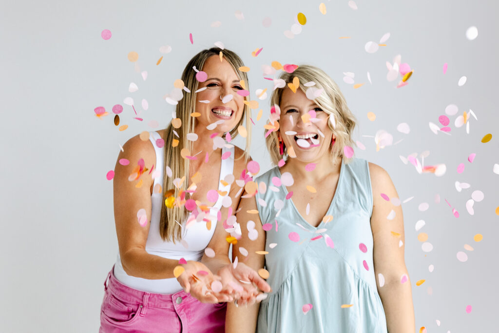
Abbey Oslin and Courtney Petersen are Minnesota-based marketing experts, educators, and co-founders of boutique marketing agency Duo Collective, which specializes in helping your brands get seen and found online. We build memorable brands, strategy-first websites and strong SEO strategies that get small business owners and creative entrepreneurs, like you, found.
If you haven’t met us yet, pop over to the podcast. It’s the next best thing to hugging in person (yes us Midwesterns hug a lot)— it’s like joining us for a cup of coffee. 😜


+ show Comments
- Hide Comments
add a comment