

Who doesn’t love a little craft night? We do when we don’t have kids running all over the house (sooo never 😜) While we wish we had more time to get crafty, we got to use our creative energy on a branding portfolio for Natalie In Stitches, which was just as fun!
From hand-drawn icons to custom patterns, her new branding feels aligned to who she is, and that’s all we could ever want!
Who is Natalie in Stitches?
When craft, education, and legacy intertwine, a branding portfolio needs to feel just as intentional as the work itself. Natalie In Stitches is a sewing and knitwear education brand built on deep expertise, generational craftsmanship, and a genuine love for helping people create garments that fit beautifully and feel meaningful.
Natalie serves primarily women makers who value quality, learning, and slowing down to create something by hand. Her audience ranges from curious beginners to experienced sewists and knitters who want thoughtful instruction, beautifully designed patterns, and a brand that feels as comforting as it is credible.
With roots in traditional dressmaking and knitwear design, Natalie’s story is woven with heritage, teaching, and care. Her work honors the long line of makers who came before her while inviting a new generation to fall in love with the process.
The Branding Portfolio Challenge
Before working together, Natalie faced a challenge we see often with highly skilled creatives. Her work was exceptional, but her visual brand didn’t fully reflect the depth, warmth, and professionalism behind it.
She was juggling multiple offerings — knitwear patterns, courses, education, and consultancy — without a cohesive brand system to hold everything together. The existing visuals didn’t clearly communicate her positioning as a trusted expert or help her audience instantly understand the value of her work.
Natalie needed a brand that felt established, welcoming, and timeless, while still leaving room to grow into future offerings like books, digital products, and expanded education.
The Solution: Strong Brand Foundations
Natalie chose our Brand Basics package, which allowed us to focus on building a strong, flexible foundation she could confidently use across platforms.
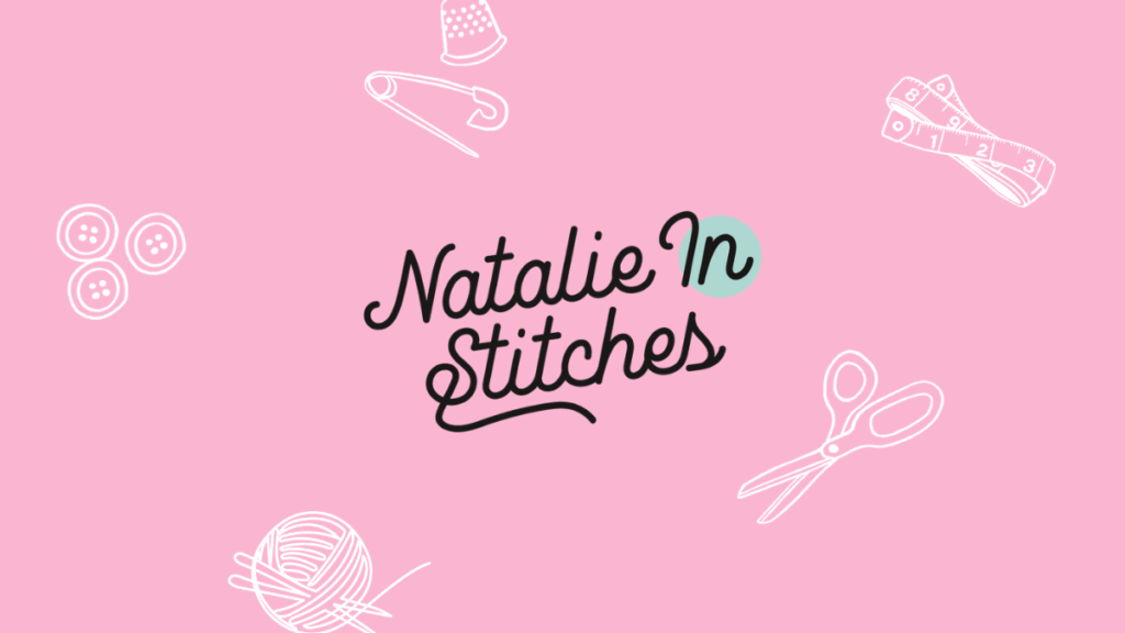
Our approach centered on clarity, longevity, and emotional connection. We leaned into a color palette inspired by textiles, florals, and heritage craftsmanship — soft pinks, warm golds, calming blues, and grounded neutrals that feel both creative and reassuring.
From a strategy perspective, we designed the brand to support Natalie’s role as an educator first. Every visual decision was made to reinforce trust, approachability, and expertise, helping her audience feel supported and capable from the very first interaction.
What We Built
For Natalie In Stitches, we created a brand system that feels handcrafted yet polished, much like her work.
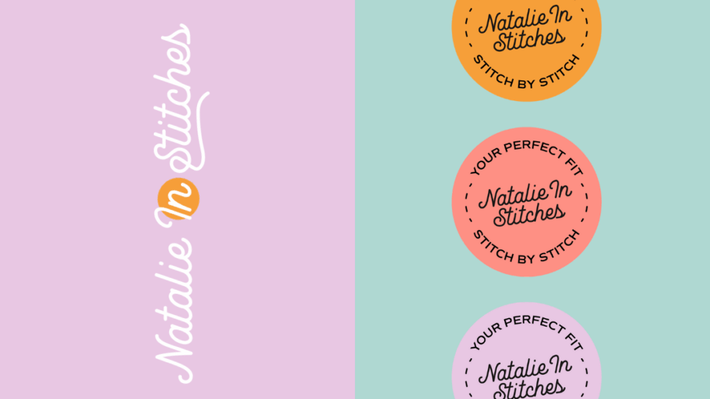
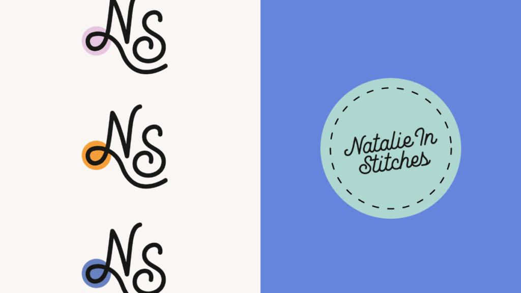
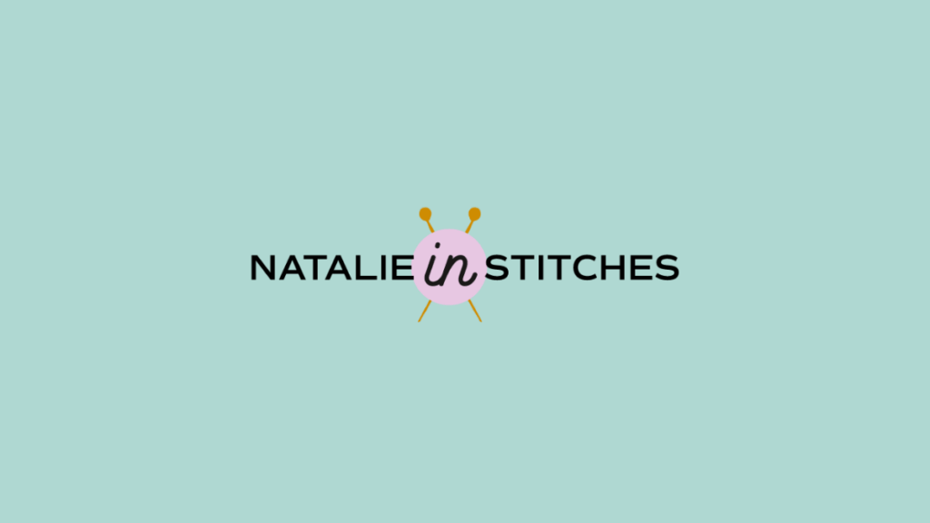
Primary Logo & Secondary Marks
A custom wordmark that balances warmth with professionalism, paired with supporting logo variations that work across patterns, course materials, and digital platforms.
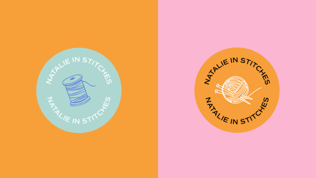
Submarks & Badges
Circular and simplified logo marks designed for versatility, perfect for social media, pattern covers, and educational assets.
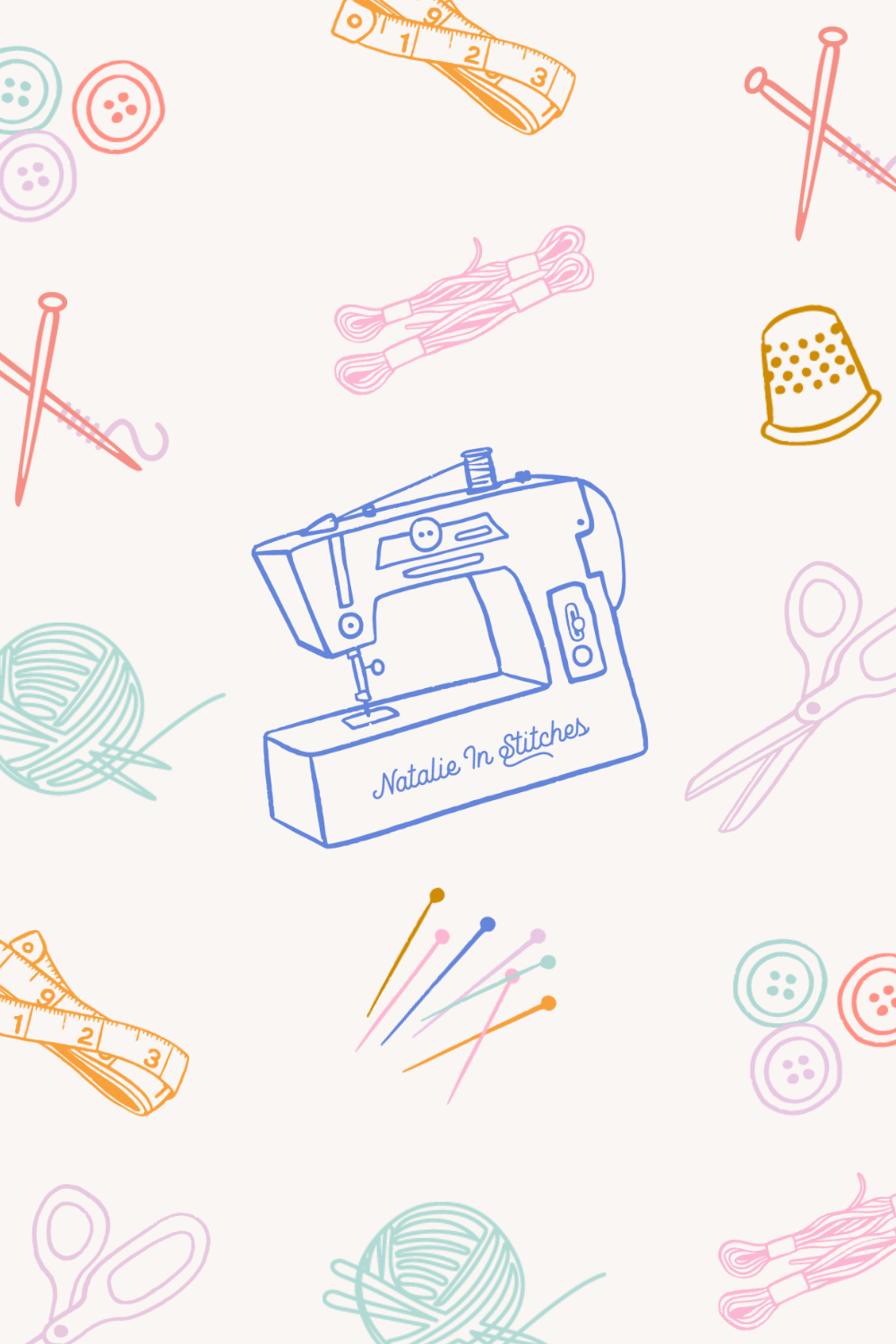
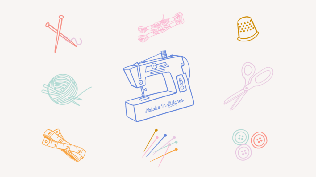
Custom Illustrated Icons
One of the standout elements of this brand is the hand-drawn icon set. We created custom illustrations of sewing and knitting tools — including scissors, yarn, needles, buttons, measuring tape, and a sewing machine — to bring a tactile, personal feel to the brand. These icons add visual storytelling while reinforcing Natalie’s expertise and craft-focused approach.
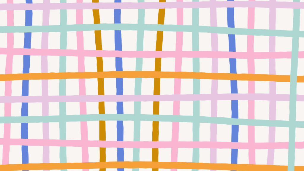
Pattern & Texture Elements
Soft grid-style patterns and illustrated motifs inspired by textiles help the brand feel layered and rich without becoming overwhelming.
The Result: Cohesive, Confident, & Aligned!
The final brand feels cohesive, confident, and deeply aligned with Natalie’s story. The visuals now support her credibility as an educator while still feeling friendly, human, and creative.
With this new identity, Natalie has a brand system she can grow with — one that supports her courses, patterns, written work, and future offerings without needing to reinvent her visuals each time.
The brand now visually communicates that trust before a single word is read.
Behind The Scenes: Our Favorite Details
Our favorite part of this project was creating the custom illustrated icon suite. Each illustration was intentionally designed to feel slightly imperfect and hand-drawn, mirroring the beauty of handmade garments.
From the yarn ball to the sewing machine illustration, these details bring warmth and personality to the brand while reinforcing Natalie’s craft. They’re small elements, but together they tell a powerful story about care, skill, and creativity — exactly what Natalie brings to her work.
Ready to see Natalie In Stitches in action? Explore her patterns, courses, and educational offerings.
Head on over to our Portfolio Page to see more of our client’s Custom Brand Designs!
Are You Ready to Build Your Brand?
If your brand looks good but doesn’t feel right anymore, it might be time to rediscover who you’ve become.
At Duo Collective, we help business owners create brands that don’t just turn heads— they tell stories, spark emotion, and bring alignment back to your business.
Let’s build a brand that finally feels like you.
More From The Duo
Sign Up for Tuesday Confetti Drop Newsletter
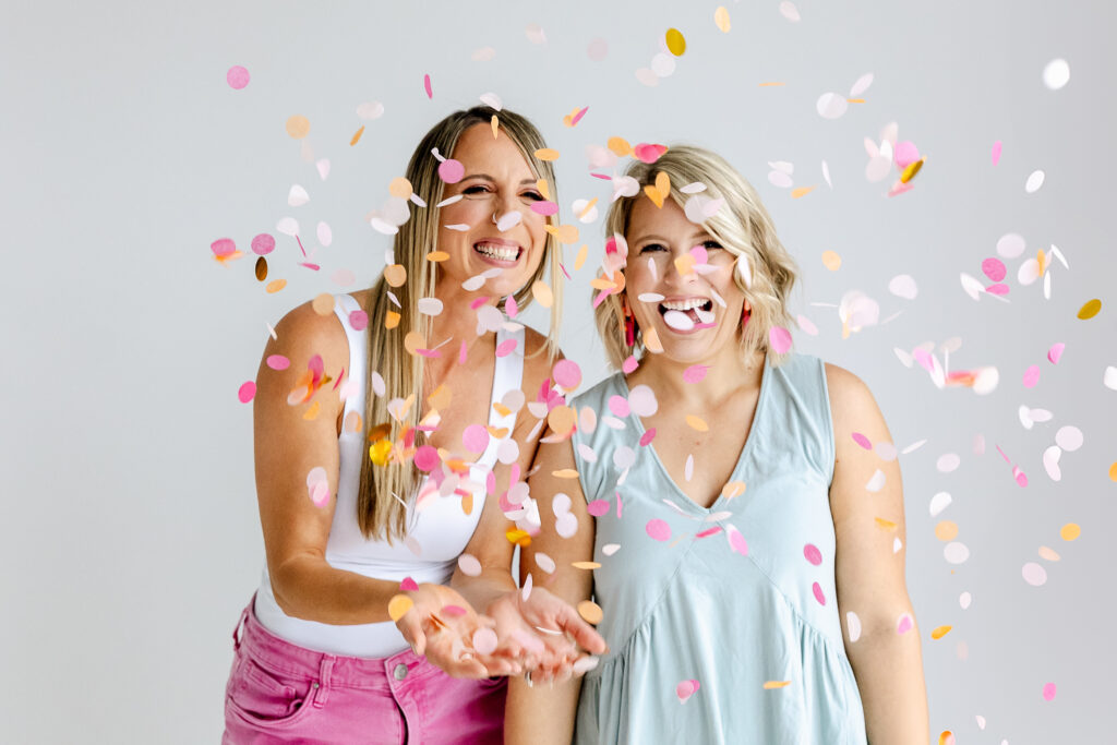
Abbey Oslin and Courtney Petersen are Minnesota-based marketing experts, educators, and co-founders of boutique marketing agency Duo Collective, which specializes in helping your brands get seen and found online. We build memorable brands, strategy-first websites and strong SEO strategies that get small business owners and creative entrepreneurs, like you, found.
If you haven’t met us yet, pop over to the podcast. It’s the next best thing to hugging in person (yes us Midwesterns hug a lot)— it’s like joining us for a cup


+ show Comments
- Hide Comments
add a comment