
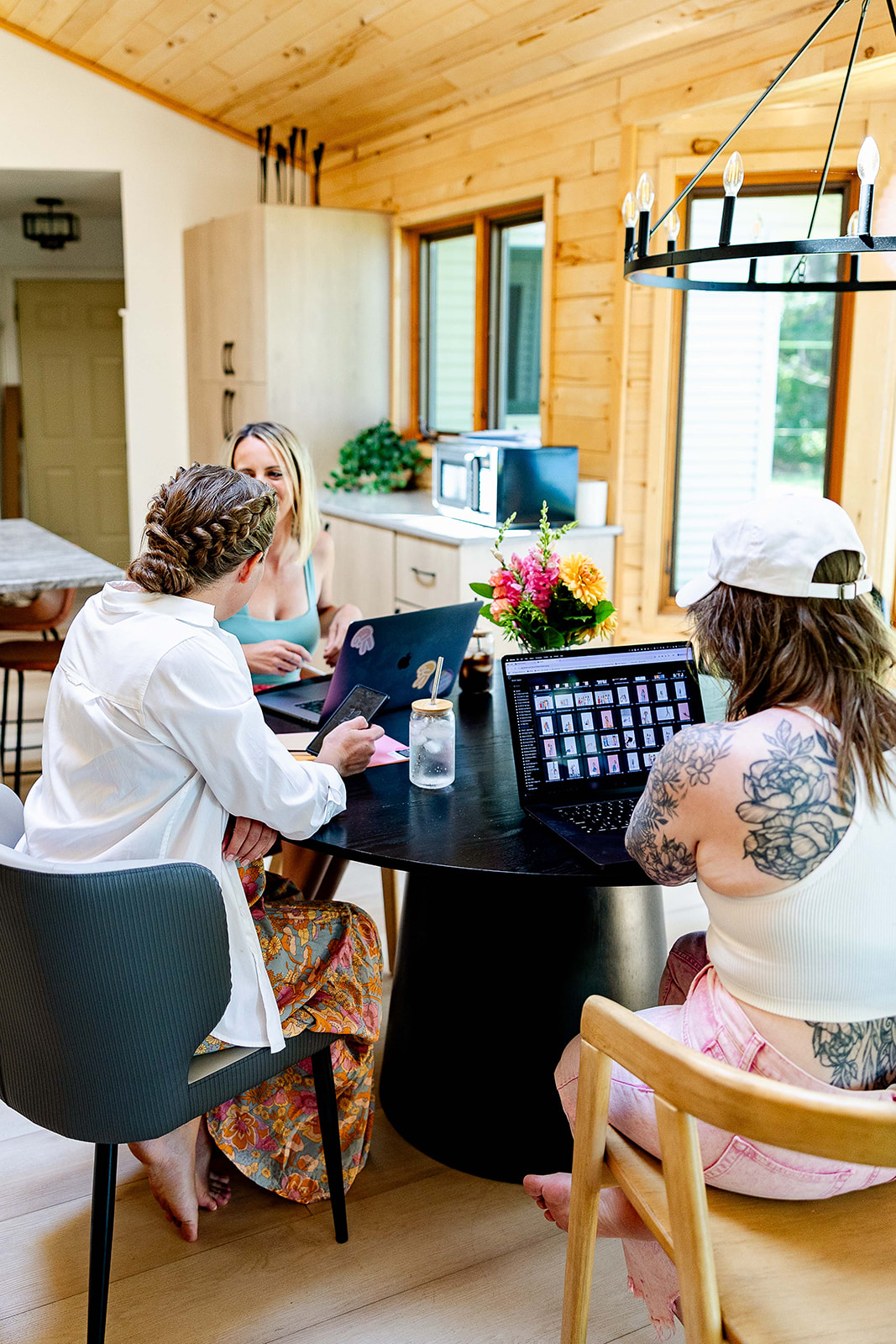

Creating a brand mood board is the very first step we take when doing any kind of design work for our clients.
Brand mood boards aren’t designated only for brand and logo designs. Its purpose is to help you see the full picture of your brand in the eyes of your audience.
It’s one of our favorite parts of the branding process! If you’ve ever wondered how we go from words and strategy to visuals that feel spot-on, this is where the magic happens.
The visual component of your brand is so important. Does it look like one cohesive brand? Or does it look like you could have three different businesses?
If it’s the latter, then listen up. This episode is for you!
By the end, you’ll see how a single page of visuals can become the heartbeat of your brand — helping you make confident design decisions, get everyone on the same page, and keep your visuals consistent no matter where your brand shows up.
Key Takeaways:
- An overview of what a brand mood board actually is
- Why it’s such an important step in building a strong brand
- How we use them here at Duo Collective to guide every project
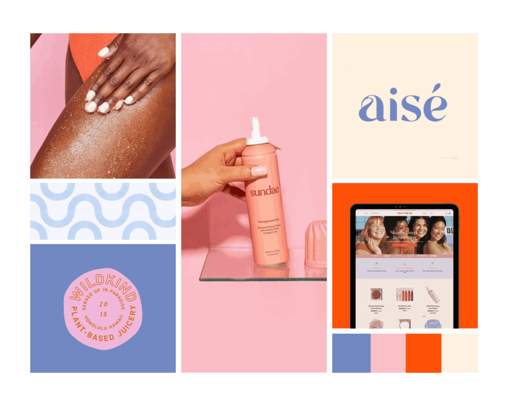
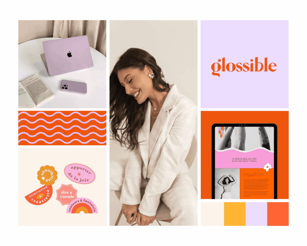
- Real client examples showing how different mood boards capture completely different brand personalities
What Is a Brand Mood Board?
A brand mood board is a collection of visuals—colors, fonts, imagery, textures, patterns, icons, illustrations—that capture the essence and emotion of a brand.
Every part of the mood board is intentional and aligned with brand strategy. Mood boards act like a visual translation of brand words.
For example:
- If a brand’s tone is “playful and approachable,” the mood board might feature bright colors, hand-drawn elements, and casual typography.
- If a brand’s tone is “timeless and elegant,” the board might use muted tones, minimal design, and serif fonts.
Here are some real client examples to show you what we mean!
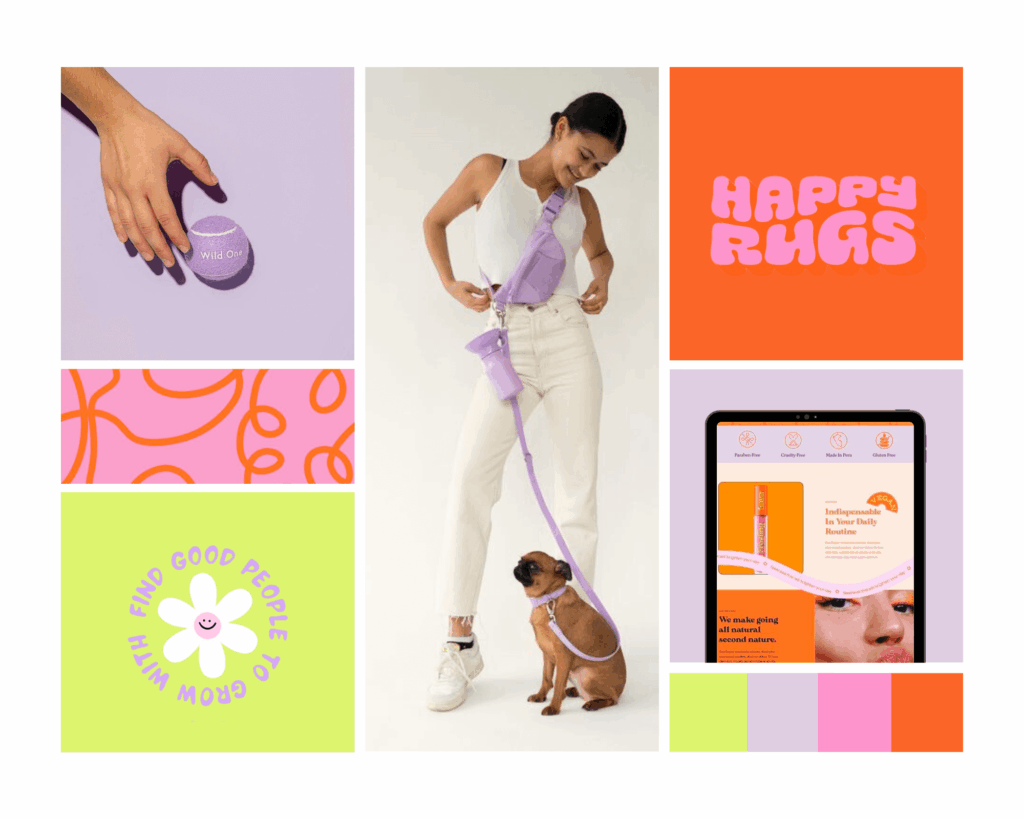
Amusejoy Poo Bags Brand Mood Board → bold, colorful, playful → instantly communicates a lighthearted, fun, approachable brand.
DWD Travel Brand Mood Board → soft neutrals, elegant imagery → communicates romance, adventure, and sophistication.
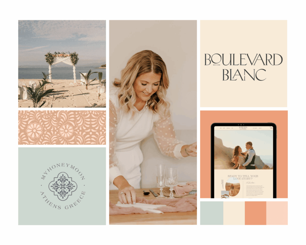
The contrast: one is bright and bold, the other serene and dreamy. Both communicate brand personality, just in different directions.
Mood boards really help bridge that gap between the abstract—“We want to feel empowering and approachable”—and the concrete fonts, colors, and imagery that communicate that.
They are strategic tools, not random Pinterest collages. They translate abstract brand traits into tangible visuals.
What is the purpose of a brand mood board?
A mood board defines the essence of your brand. It brings together both visual and emotional components of your business. It also ensures consistency across all elements.
Take social media for example. For Instagram alone you have organic posts, stories, IGTV, reels, and paid advertising. A mood board should lay the visual groundwork for all of these elements.
Plus, a good brand mood board will give you an understanding of your business’s first impression. We all know looks aren’t everything, but they do catch your audience’s attention and get them to dig deeper into your offerings.
That first impression is key, especially in the creative industry.
Why Mood Boards Are Important
Are brand mood boards actually necessary, or are they one of those things that the “experts” say you need to have?
We’re here to confirm that yes, every business needs a brand mood board, and here’s why.
Visual Clarity and Alignment
Words like “bold,” “timeless,” or “playful” can be interpreted differently. A brand mood board ensures everyone is on the same page.
Look at the difference between the Graceful & Free Brand Mood Board and The Social Cow Brand Mood Board.
Graceful & Free is light, approachable, and fun.
The Social Cow is rich, artisanal, and upscale.
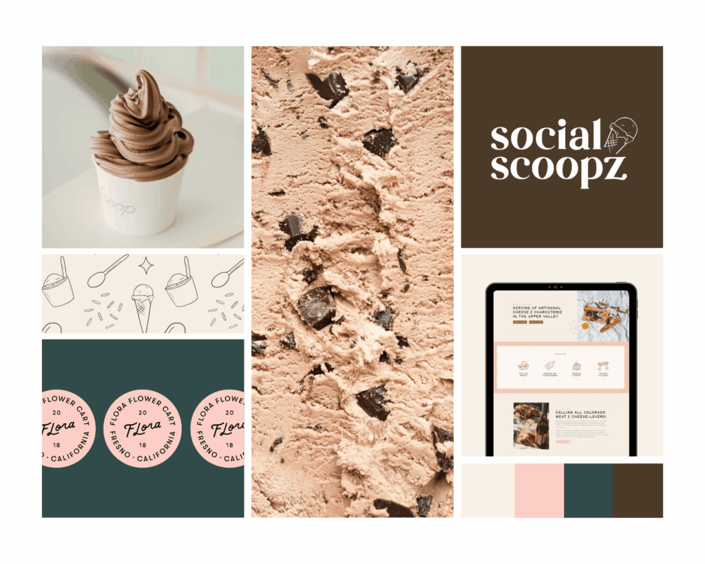
Both feel inviting, but one leans casual and friendly while the other communicates a crafted, elevated experience. Without a mood board, trying to describe that difference in words would be tough.
Creative Spark
Mood boards encourage exploration before investing time in final design work. Sometimes you might like two completely different visual directions for various reasons. This phase allows us to explore all of the directions you like before diving head first into the development of your brand.
Primal Wellness Brand Mood Board leans into bold, energetic colors paired with clean, modern layouts—helping clarify that the direction should feel vibrant and empowering versus more minimal and serene (like one could initially imagine it would look.)
Strategic Bridge
A brand mood board ties brand strategy directly to visuals.
Target audience → values → mood board → design.
Legal Bestie Brand Mood Board shows how professional trustworthiness can still feel modern and approachable—balancing warmth with authority through bright, bold colors and typography.
Client Engagement and Expectation-Setting
In client work, mood boards serve as a checkpoint: “Does this direction feel right?”
It builds excitement, confidence, and buy-in before the bigger design work begins.
It also helps prevent the dreaded “I don’t like it” reaction later in the process. We talk in episode #179 about how to give constructive feedback to your designer!
Mood boards give clients that “yes, this is me!” moment early on.
What does a brand mood board consist of?
Typically, a mood board consists of the following five elements:
1. Colors
Choosing the right colors for your brand can be tricky, so here is our advice.
- First, choose timeless over trendy. The color that is hot right now, might not be next season.
- Second, your brand colors should be a unique reflection of your business personality. Choose colors that you love and feel a strong connection too.
- Then, make sure you check out the underlying psychology of those colors and ensure they match your business.
- Finally, make sure to choose 1-2 main brand colors and 1-2 neutral accents to offset them.
The bright poppy orange we chose for Duo Collective wasn’t chosen at random. We love the pop of orange surrounded by more subtle tones of orange and brown.
Orange is a color known for optimism, creativity, energy, curiosity, confidence and playfulness. This describes not only our business, but our personalities as well.
2. Logo variations
You should have a variety of logos and submarks to use depending on the platform you are focusing on. Your website should be home to your main logo, whereas your social media pages might house a different submark.
3. Type styles
When it comes to choosing a font, you can go a little crazy with the number of options out there. If you aren’t sure where to start, pop in Canva and experiment with some of their templates. Creative Market is another amazing resource you can use to purchase a brand font.
We just have two words of advice when choosing a font.
- Choose a web-friendly font: Not all fonts are picked up by browsers. Meaning if you choose a font that isn’t supported by Google Chrome that font will automatically revert to something boring like Times New Roman.
- Look up the legal licenses of your chosen font: You can run into a lot of legal issues with fonts, especially those crazy, fun fonts with all the dots and squiggles. Do yourself a favor and make those investments, it’s not worth the legal battle.
4. Photography
When choosing photography for your brand mood board, there is so much to think about.
Consider model photography. Are your model shots close in and focused or are they zoomed out to allow your audience to take in the full environment?
Consider non-model photography. Do you want to feature beautiful office spaces, delicious food shots, or pops of nature? What types of guidelines do you want to set on these images?
Don’t forget to check out Unsplash or Pexels to supplement any of your brand photography. There are hundreds of images to choose from to match your brands visual aesthetic.
5. Patterns
Patterns might be our favorite part of a brand mood board! Here’s where you can really have some fun. Play around with some of your logo elements or try exploring a simple dot pattern. Canva offers a bunch of pattern templates you can play with using your brand colors. Start there!
How We Use Mood Boards at Duo Collective
This is a foundational step in our process. Every branding project starts here—before logos, patterns, or website layouts.
Our process:
- Brand questionnaire and strategy
- Curating inspiration that aligns with audience and personality
- Presenting a cohesive mood board as a checkpoint
The brand mood board informs everything: logo design, typography, colors, website layout, even social templates.
The DWD Travel Brand Mood Board served as the foundation for a destination wedding and travel planner brand. The soft romantic palette influenced everything from the typography to the web design.
The Amusejoy Poo Bags Mood Board helped us lean into a colorful, playful direction for packaging and digital presence and the personal touches like bringing in illustrations of her own pups.
The role of strategy: The mood board isn’t built in isolation. It’s built from the insights we’ve gathered about who the brand is and who they’re speaking to.
The end result? Strategic and aligned logos, fonts, and color palettes.
A brand mood board acts as a visual “north star” that keeps everything cohesive, both now and in the future.
How to use your brand mood board?
Now that you’ve built this amazing mood board… what do you do with it!?
This document should be used both internally within your own business and shared with any outside partners who you will be collaborating with. Reference it any time you create new brand elements like a new landing page for your website or a social media post.
The great thing about this resource is that it can be shared with any outside parties who might be doing any design work for you. A brand mood board, when built correctly, has the power to create a cohesive visual strategy across all of your business elements.
And that is exactly why it’s so important!
Do You Need a Brand Mood Board?
Mood boards are a strategic foundation, not just a creative exercise. Not fluff, but foundational.
They:
- Align everyone visually and strategically
- Spark creativity and exploration without commitment
- Bridge brand strategy with actual design
- Excite clients and build confidence in the process
If you want your brand to feel consistent, intentional, and memorable, starting with a mood board is so important—it’s your brand’s heartbeat in a single glance.
Need a new brand strategy and mood board? We’re ready to create a brand strategy and mood board that feels aligned with your values and goals. See how we can support your growth!
FAQs About a Brand Mood Board
A lot goes into creating a brand mood board, but here are the basics:
-Clarify your brand values, target audience, brand personality, and core messaging.
-Choose a platform to create your mood board (Canva, Pinterest, Milanote, Figma, or Adobe Illustrator.)
-Look for images, colors, textures, typography, and patterns that feel like your brand.
-Aim for 10-15 carefully chosen visuals that represent your color palette, typography style, imagery style, textures, patterns, and lifestyle.
Designers use mood boards to influence the rest of the brand design, from fonts and logos to web design and marketing. It’s the starting point for creating a strategic and aligned brand.
Brand mood boards are strategic tools, not random Pinterest collages. They translate abstract brand traits into tangible visuals.
Want to Listen?
Apple Podcasts | Spotify
If you liked today’s episode on The Duo On Air Marketing Podcast, don’t forget to leave us a review & subscribe!
More From The Duo
Sign Up for Tuesday Tips and Sips Newsletter
Abbey Oslin and Courtney Petersen are Minnesota-based marketing experts, educators, and co-founders of boutique marketing agency Duo Collective, which specializes in SEO, social media strategy, and branding for small business owners and creative entrepreneurs. To learn more about Duo Collective, or to inquire about working with our team, head over to www.duocollective.com.
To inquire about being a guest on Duo On Air, please fill out this application form.


+ show Comments
- Hide Comments
add a comment