



We want you to visualize something for us… Close your eyes and picture this.
Someone finds you — maybe through a referral, maybe through Google, maybe they saw you on Instagram. They’re literally looking for someone who does exactly what you do.
And they go to your website… and they leave. Not because you’re not good enough or your pricing didn’t align. But because your website gave them a reason to keep shopping.
We’re talking about the “good” websites that look fine on the surface but are quietly costing you leads and sales every single week.
It’s called the “good enough” theory. And while you might think it means ‘ugly’ or ‘broken,’ it actually means your site exists and loads, but nothing more.
Why does this happen?
The good enough trap happens when small business owners stop improving their website once it’s live. They finally finish all the design, copy, and SEO, and think they have a good website forever.
The relief of launch causes stagnation. “I’ll fix it later” becomes “I forgot it existed.”
And over time, little things will start to turn leads away from your website and to a competitor.
How do you identify if you fall in the “good enough” trap?
Functional does not equal effective. Most websites are functional. But not all websites are effective.
Your website runs 24/7, with or without you. While you sleep, while you grocery shop, while you make dinner.
The question is whether it’s working FOR you or against you.
Here’s a quick gut check. 4 questions to ask yourself right now:
- When did you last look at your website like a stranger?
- If a dream client landed on your homepage today, would you be proud?
- Do you cringe even slightly when you send someone your URL?
- Does your website still represent who you are as a business?
If any of these questions are a little hard to answer, it’s a sign your website needs a few updates.
The 4 conversion leaks and where your “good” website is losing people…
Conversion leaks are opportunities to update your website, so leads are convinced to work with you rather than go somewhere else. So don’t feel bad if you land in one of these categories —website mistakes can happen without us realizing it!
Leak 1: The homepage that explains what you do, but not why it matters.
Most homepages are written for the business owner, not the visitor. But the visitor is the one reading it and considering working with you. Everything on a really good website is geared toward the reader, not the business owner.
Try the “above the fold” test: Does a stranger know who you help and what you do in 5 seconds?
If you knew nothing about us, could you guess what we do and who we do it for based on our “above the fold” test?

Leak 2: A services page that lists features but sells no transformation.
Features tell, transformation sells. Most service pages focus on the features, but all readers care about the transformation.
The “Feature vs. Transformation” Shift:
- Features explain the “what.” They are the specs, deliverables, and processes. This is still important information, but it can’t do all the selling for you.
- Transformations explain the “so what.” They are the results, feelings, and upgraded reality your customer gets. This is what future clients NEED to know before deciding to work with you.
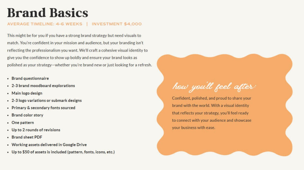
Here’s an example of our investment guide. We list out everything included in the package, but bring focus to how they will feel after working with us. This is the transformation copy that closes inquiries.
Leak 3: A contact or inquiry form that creates friction instead of confidence.
The moment someone reaches your contact page, they’re basically raising their hand and saying, “I want to work with you” — don’t lose them here!
3 inquiry form mistakes:
- Too many fields
- No reassurance copy
- No clear “what happens next.”
The goal here is to make it as easy as possible for someone to inquire about your services.
Duo’s contact page example: Look at it right here!
- We have just enough fields to give us the information we need from a new lead. Nothing overly complicated.
- We have a field for them to get into more detail about what they need.
- Be playful if that’s your brand. We ask about their furry friends!
- Explain what happens next after they submit the form.
- “We can’t wait to hear from you! Please expect a response within 1-2 business days. Need to chat with us sooner? Send us a DM on Instagram!”
- Include FAQ’s on the page (a little hack to increase the word count on a page that notoriously lacks content!)
Leak 4: Brand inconsistency that quietly loses trust.
When the vibe of your other marketing channels doesn’t match your website, people feel the disconnect, even if they can’t name it.
If someone finds you on Instagram and navigates to your website, and it’s a completely different vibe, they’re confused and most likely moving on. Uncertainty within your brand creates uncertainty for them and can drive them away.
Fonts, colors, and tone of voice that shift page-to-page signal “amateur” to a cold visitor.
How to audit your own site in 10 minutes
As business owners, we sometimes fall into the “curse of knowledge” where we know too much about our business to be able to see it like a stranger.
We’re SO familiar with a topic that we accidentally assume everyone else knows the same things we do. Once you’ve learned something, it’s surprisingly hard to remember what it felt like not to know it in the first place.
Here are a few tests you can run through to see if your good website is actually just good enough.
The 5-second homepage test
Cover your screen, then uncover it. What’s the first thing you read?
Does it answer: who is this for, what do they do, and why should I care?
The “brand walk”: Reading your site like a first date.
What impression does this site give in the first 30 seconds? Swipe right vibes or rejection vibes?
Does the voice sound like a real person or like ChatGPT?
Would you want to work with whoever wrote this?
The inquiry path test — click through your own contact process.
Start from your homepage and try to book yourself. Time how long it takes and note every moment of friction.
Most business owners have never done this and are shocked when they do.
The “send it to a stranger” test.
Ask someone who doesn’t know your business to spend 60 seconds on your site and tell you what they think you do.
The answer is often humbling and incredibly useful.
Quick wins vs. real fixes — how to prioritize what you find
Depending on what you discover from these website tests, you might need to make some updates to your website.
DIY fixes you can make this week (no designer needed)
- Rewrite your homepage headline to answer “who I help and what changes for them.”
- Add one line of reassurance copy above your contact form.
- Update your services page to lead with outcomes, not deliverables.
Branding fixes that are worth doing properly (not half-assed)
- Inconsistent visual identity across pages — this needs a systematic approach, not patchwork.
- If your brand no longer represents you, a refresh is worth the investment before you drive more traffic.
If you’re working on an outdated platform, have structural navigation problems, or have a brand that’s over 3 years old, DIY patchwork won’t cut it. You’ll need to bring in experts who can make sure everything is updated and conversion-friendly from the start.
“Good Enough” Is Costing You More Than You Think
“Good enough” is a slow leak, not a good website. Your website is always making an impression — make sure it’s a good one!
If your website tests reveal that it’s time for a new, optimized website, our Showit web design services might be perfect for you! Because we don’t just slap together a pretty template and send you on your way. We design strategic, SEO-optimized websites that convert visitors into clients.
Wanna chat about it? Fill out our contact form to learn if it’s right for you.
Listen On The Go!
Apple Podcasts | Spotify
If you loved today’s episode of The Duo On Air Podcast, we’d love for you to leave a review on your favorite platform and hit subscribe for those new episodes dropping every Monday — it helps more small business owners find us (and let’s be honest, that’s good SEO ).
More From The Duo
Sign Up for Tuesday Confetti Drop Newsletter
Abbey Oslin and Courtney Petersen are Minnesota-based marketing experts with over 20+ years of combined experience working with big brands. They are educators and co-founders of Duo Collective; a boutique organic marketing agency specializing in SEO, branding, and custom websites for women-led small businesses and creative entrepreneurs.
Ready to grow your visibility and become unforgettable?
Learn more or work with our team here.
To inquire about being a guest on Duo On Air, please fill out this application form.



+ show Comments
- Hide Comments
add a comment