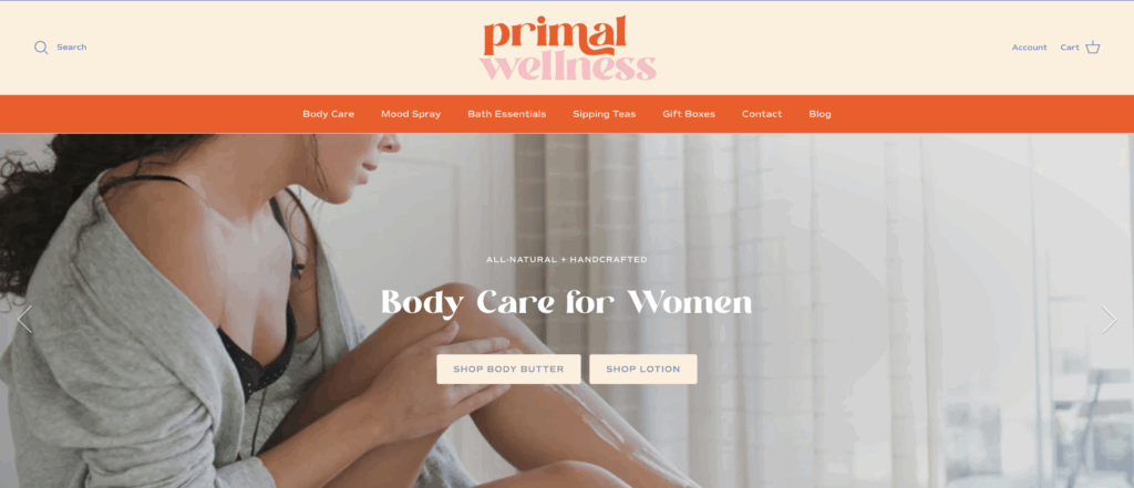
When Primal Wellness came to us, they had all the heart and passion behind their brand… but needed a visual identity that matched the power of their story.
Rooted in nature, wellness, and simplicity, Primal Wellness was born out of a deep desire to help women navigate every season of life with ease and confidence. The brand’s founder, a dental hygienist, massage therapist, and holistic health coach, has spent years studying the body and crafting natural products that actually work.
From hand-whipped body butters to calming sleep remedies, every product is created with purpose and care. But what truly sets this brand apart is its mission: to remind women that slowing down, tuning in, and trusting nature is the ultimate act of self-care.


The Branding Challenge
Before partnering with Duo Collective, Primal Wellness had strong products and a passionate purpose, but their branding didn’t reflect it yet.
The founder knew what she stood for: wellness made simple, natural, and effective. But her visuals and messaging felt too broad. Was she speaking to everyone interested in wellness, or specifically to women navigating menopause and midlife transitions?
Without a clear brand voice or strong online presence, she felt confident in person (especially at pop-up markets!) but unsure how to communicate that warmth and trust online. It was time to build a brand that felt as natural and nurturing as the products themselves.
The Solution was a Full Rebrand…
To bring her vision to life, the founder chose our Brand Creation Package. The perfect fit for wellness brands ready to evolve beyond DIY visuals into something truly intentional.
We began with deep brand strategy: defining her mission, audience, voice, and visual direction. Through this process, it became clear that Primal Wellness needed to stand for organic indulgence: beauty and balance inside and out.
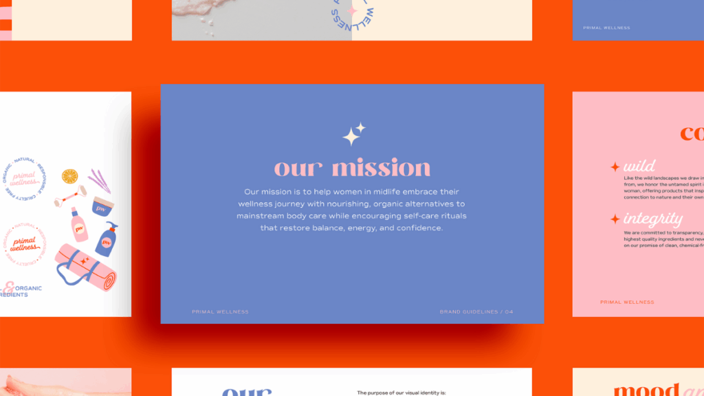
From there, we explored color psychology that felt grounded yet vibrant. The result? A palette that celebrates soulful simplicity and timeless energy. Coral orange for vitality, lavender blue for calm, and blush pink for feminine softness.
We paired those with elegant yet approachable typography to capture her duality— scientific knowledge meets nurturing care. The overall vibe feels clean, elevated, and confident, just like her products.

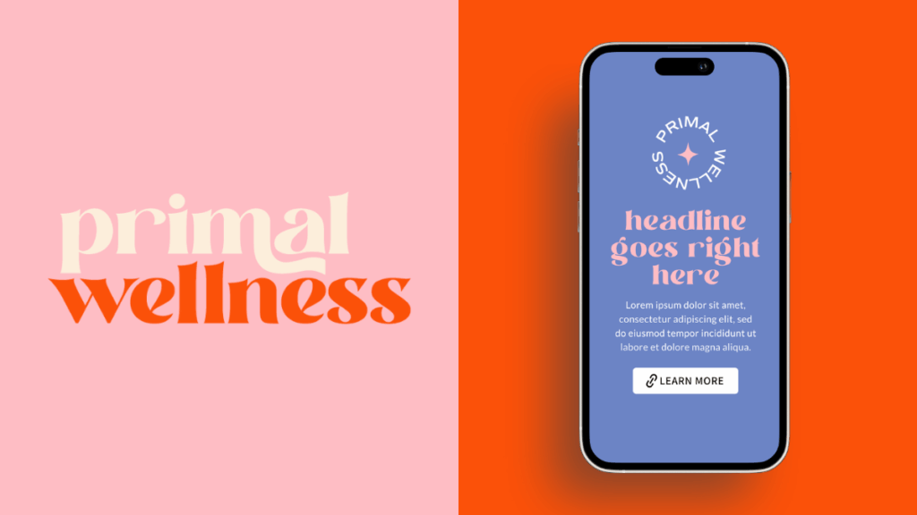
What We Built
Once we had clarity on her foundation, we built a full visual identity that radiates wellness and warmth from every angle:
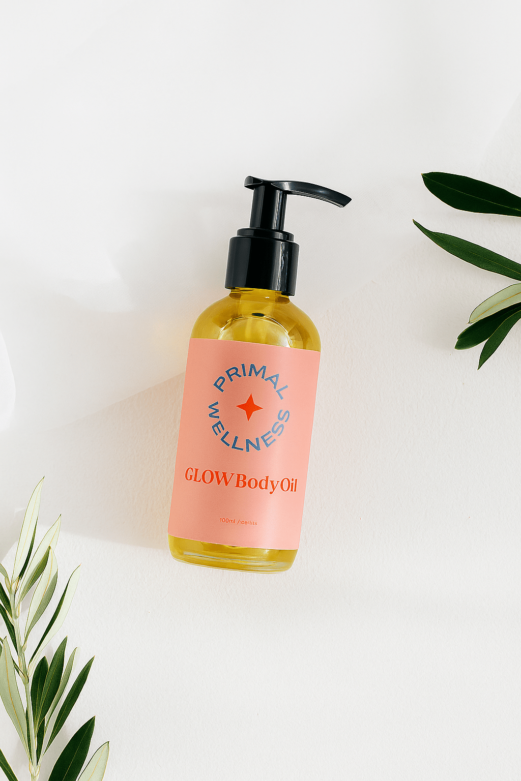
- Main Logo: A refined, organic wordmark blending soft curves with confident serifs, representing both nurture and strength.
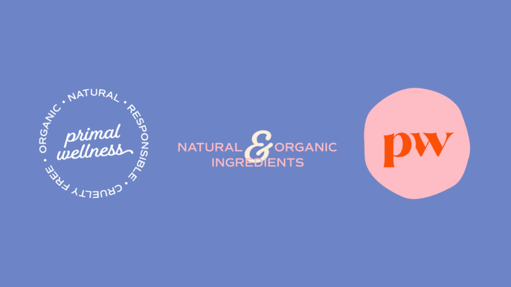
- Submarks: Circular emblems inspired by botanical beauty and the idea of “wellness from the inside out.”
- Monogram (PW): A bold yet minimal mark designed for labels, packaging, and digital use.
- Color Palette: Warm coral, timeless cream, deep periwinkle, and soft blush— a combination that feels both fresh and grounded.
- Typography System: A classic-meets-modern pairing that feels holistic yet high-end.
- Custom Patterns: Flowing organic stripes inspired by nature’s movement… playful, imperfect, and calming all at once.
Together, these elements tell a story of empowerment through simplicity. Encouraging women to embrace a more natural, nourishing approach to wellness.
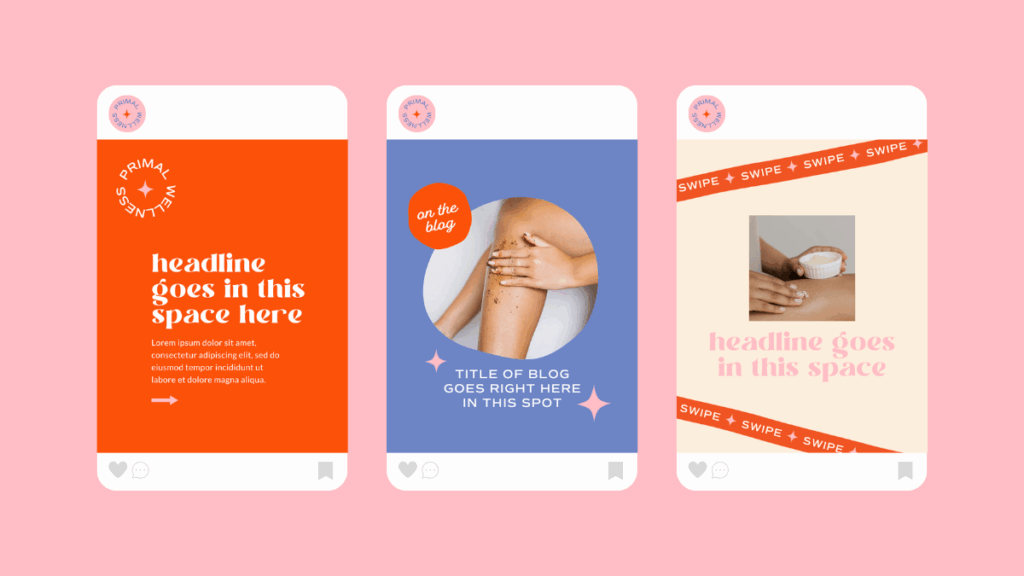
The Result & Full Brand Reveal!
The new Primal Wellness brand feels completely aligned with its purpose— simple, soulful, and full of life.
Since launching her new look, the founder has gained clarity and confidence in how she shows up online. She’s already received incredible feedback from returning customers who say the new packaging “feels like a breath of fresh air.”
Her products now reflect what they’ve always promised: natural indulgence without compromise.
Behind The Scenes: Our Favorite Brand Details
Our favorite part of this project? The “Inside & Out” concept. It became the heartbeat of the brand.
You’ll spot it subtly worked into the circular submarks, the tagline, and even the pattern design. It’s a nod to the belief that wellness starts from within and radiates outward— a perfect visual and emotional anchor for this brand.
We also loved how the coral and lavender pairing created a fresh, unexpected contrast… instantly memorable and unlike any other wellness brand in the space.
Are You Ready to Build Your Brand?
If your brand looks good but doesn’t feel right anymore, it might be time to rediscover who you’ve become.
At Duo Collective, we help business owners create brands that don’t just turn heads— they tell stories, spark emotion, and bring alignment back to your business.
Let’s build a brand that finally feels like you.
More From The Duo
Sign Up for Tuesday Tips and Sips Newsletter
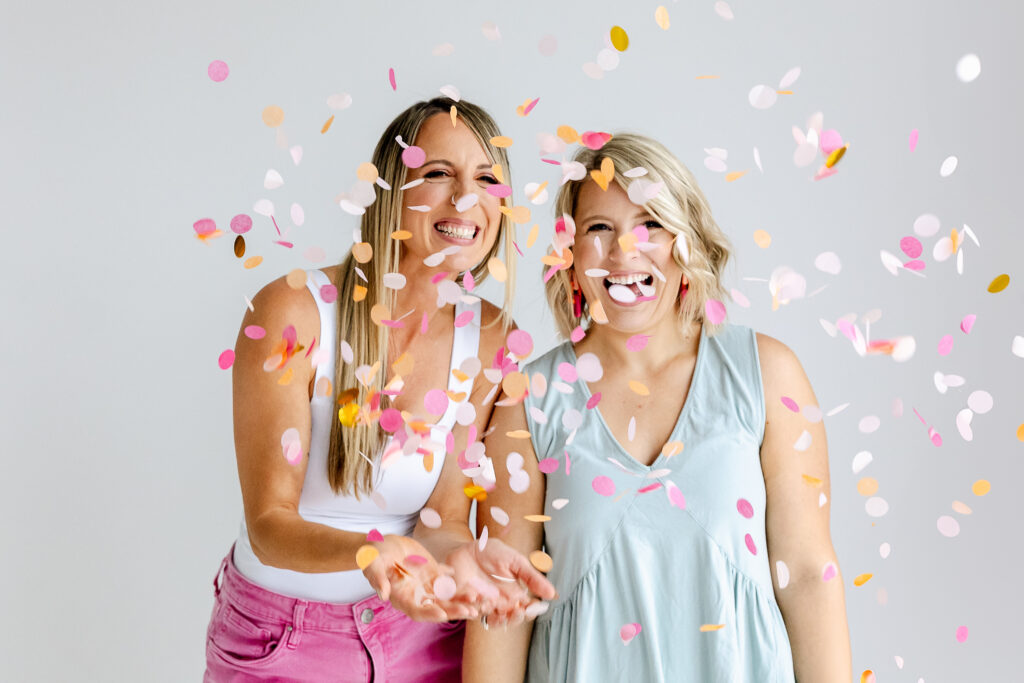
Abbey Oslin and Courtney Petersen are Minnesota-based marketing experts, educators, and co-founders of boutique marketing agency Duo Collective, which specializes in helping your brands get seen and found online. We build memorable brands, strategy-first websites and strong SEO strategies that get small business owners and creative entrepreneurs, like you, found.
If you haven’t met us yet, pop over to the podcast. It’s the next best thing to hugging in person (yes us Midwesterns hug a lot)— it’s like joining us for a cup of coffee. 😜
+ show Comments
- Hide Comments
add a comment